Sunday, 31 March 2013

Question 4 of Evaluation: How did you use Media Technologies in the Construction and Research, Planning and Evaluation Stages?


Blogger

The blog format, which we used for our practical coursework, was called ‘Blogger.’ It helped me to build and create my ideas and plan them in a very organised manor, as I was regularly and frequently updating and posting on my blog. I found the blog an extreme
assistance as I could just easily post my ideas and concepts. The fact that the blog was online really was an advantage as a large percentage of my practical work was to do with planning my ideas and researching conventions of my music video and ancillary texts.


Photoshop

Another media technology, which helped me during my practical coursework, was ‘Photoshop.’ This was a program I used to edit my digipak and advert therefore it was incredibly important for my ancillary texts. I found Photoshop very difficult to use at first, but I seemed to get used to using it. During the practice lessons before we started our
digipaks and adverts, was when I found it the hardest as I had never used Photoshop before. I was not familiar with the different tools that you could use on Photoshop such as the editing of pictures and images you put on there. You can turn up and down the brightness and contrast; making it stand out more, make it black and white etc. Another thing I learnt was about the different layers on a document. These layers allowed me to put different texts/ images on top of other items. Below is the layout of Photoshop, which I had to learn to use:


Final Cut Express

Furthermore another technology I used when planning and constructing my music video was ‘Final Cut Express.’ This is the program I used to edit my music video and I have used it once before in AS Media Studies when making our film openings, so I was very familiarised with this program. The only difference when using Final Cut this year, was the fact we used it to lip sync the artist’s singing in the song to our shots and music video. I found this part of the editing particularly hard, however my group and I discovered that one of our group members was very acquainted to editing and lip syncing, therefore she did the
majority of the editing. Nevertheless my other group member and I still did some of the work, but just the smaller parts prior to the task and the easier parts of the editing. Moreover, when one of my group members or both were not in for the lesson, I did do some of the editing myself. I found it a lot easier than last year as I knew what I was doing this time and I was far more imaginative than last year as I put a number of transitions in such as; dissolves and fade in to fade outs. Since my group and I had so much footage I was able to easily get rid of the bad parts or the parts that we did not want to use, so the process was quicker and more effective.
Below is a screenshot of the layout of Final Cut Express:


Hotmail

Hotmail was a very significant Internet based technology, which my group and I used. This was one of the reasons why my group and I could choose the song we did for our music video. We e-mailed the manager of Gabrielle Aplin asking for permission to use her song ‘Please Don’t Say You Love Me,’ after our other unknown artist that we were going to use cancelled on us and said she did not have time to be in our music video. We easily overcame this problem when we got a reply from her manager saying that it would be a pleasure to allow us to use the song.


YouTube

YouTube was vital to the planning and researching process as well. This is because it was very useful and beneficial when I was looking up music videos and how they had been
edited and structured. Additionally YouTube was one of the reasons as to why my group and I chose the artist we did. The artist we used ‘Gabrielle Aplin,’ was an unknown artist at the time, however she was Internet famous through YouTube.

Friday, 22 March 2013

Question 3 of Evaluation: What have you learned from your audience feedback?


I decided to create a number of questionnaires/surveys/focus groups in order to gather audience feedback of my music video and ancillary texts e.g. my digipak and magazine advert.


Pie Chart: What radio station do you think my artist’s song would be on?


I created a pie chart from the feedback I got for what sort of radio station people would think that my song would be on. From my findings I discovered that 5 out of 10 people (50%) said that my artist’s song belonged on Capital FM radio station, so the majority of the focus group. Furthermore 3 out of 10 people (30%) said that the song belonged on Magic radio station. Additionally 1 out of 10 people (10%) said that it belonged on Heart. Finally 1 out of 10 people (10%) said that my artist’s song belonged on Smooth Radio. Overall I noticed that most of the people in my focus group said that the song fitted into the songs played on Capital FM.


Table of Negative and Positive comments


Positive Comments
Negative Comments
Clear filming
Could’ve made more use of visual aesthetics when cynical atmosphere occurs
Scenic shots
Repetitive shots
Nice mix of static and handheld shots
Lack of footage
Excellent use of natural lighting

Good use of close ups


I made a table from the feedback I got for the positive and negative aspects of my music video. It was made clear that there were more positive comments that people said than negative ones. I got a total of 5 people to write positive and negative comments, all of which wrote an optimistic comment. I had 3 negative comments, however 2 of the people could not think of anything negative to write about, which I was happy about.


Bar Graph: What would you rate my music video on a scale of 1 to 10?


I decided to create a bar chart of what people would rate my music video on a scale of 1 to 10. I made it so that 1 would be the lowest and 10 being the highest. I got a total of 20 people to vote, and the feedback was very useful and optimistic.
From my feedback I gathered that people really enjoyed my music video. This is because there were no votes for the ratings 1,2,3,4,5 or 6. I got 3 votes for the rating of 7, 6 votes for the rating 8, 10 votes for the rating 9 and 1 vote for the rating of 10. I was happy with the results as not one person rated my film lower than a 7.


Pie Chart: Did you gain a clear concept of the music video's narrative on first viewing?


I created a pie chart on whether my audience gained a clear concept of my music video’s narrative on their first viewing. I asked a total of 30 people and even though a couple of people said that they did not initially gain the concept of my music video’s narrative most of my viewers said that they gained the concept. I was really pleased with these results because almost every single person understood my music video’s narrative.


Comments: What genre of music does this advert/digipak fit into?
How would you define this artist's brand identity?


I asked people from my class two questions about my digipak and advert, and they wrote down their thoughts and ideas on this A3 piece of sugar paper. The two questions I asked them were: 'What genre of music does this advert/digipak fit into?' and 'How would you define her brand identity?' The things that people said about them are as follows:

'What genre of music does this advert/digipak fit into?'
- Digipak: Acoustic, Pop and Country. The most popular genre was Acoustic.
- Advert: Country, Acoustic and Folk. The most popular were Country and Folk.

'How would you define her brand identity?'
- Digipak: Casual, Shy, Sweet and Country.
- Advert: Innocent, Sweet, Vulnerable, Youthful, Emotional, Reflective and Haunted.

Tuesday, 19 March 2013

Question 2 of Evaluation: How effective is the combination of your main product and ancillary texts?

Director's Commentary:


I have created a director's commentary for question two of the evaluation, to show the audience my artist's identity, brand image and the different themes that are portrayed throughout the music video. Here I discuss how my three texts are presented and how they all link to one another.

As mentioned in my directors commentary, for my music video, my artist is wearing very alternative clothing to suit the genre of music that she is singing. The song that Jess sings is Acoustic/Folk, and because it is quite a calming and relaxing song, her image should fit into this. We made sure that she did not wear too much make up, so that she should look natural and prevailing. Furthermore the main two themes that would suit our music video/music/genre of music were romance and love, especially in young people. I wanted to stick to these themes so that my audience did not get a different idea when they watched the music video and then looked at my magazine advert and digipak. However, I would say that there were a few minor differences between my magazine advert/digipak and my music video.

Digipak and Advert:

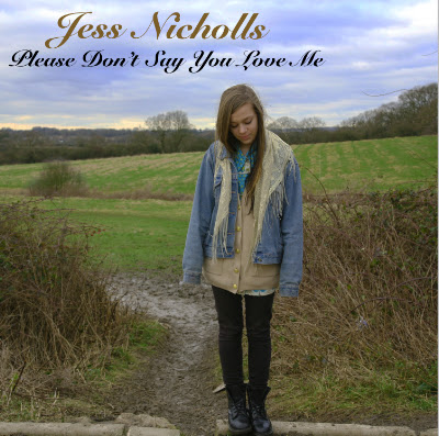
Similarities: My digipak and advert reflect similar images as my music video as I kept to the pastoral and rural setting, which connotates her natural look. Additionally, I kept to the natural lighting, especially on the front cover of my digiapk, where my artist is standing in front of an iconic country view. Also I decided to keep my artist in her alternative style of attire, so that confusion was not created amongst the audience.

Differences: Even though my digipak reflected similar images as my music video due to the rural setting, there were a few differences between it and my ancillary texts. For example on  the back cover of my digipak and the image I used for my advert, the lighting is quite dark and dim. This was because Jess was surrounded my various trees to demonstrate the idyllic setting.

Friday, 15 March 2013

Question 1 of Evaluation: In what ways does your media product use, develop or challenge forms and conventions of real media products?

Forms and Conventions of an Acoustic/Folk music video:

- Acoustic/folk music video actors and singers tend to have a unique style of Mise en Scene e.g. their make up and fashion sense being alternative. 

I have used this convention, as both my two actors and singer, have an unusual dress sense, for example my actress is wearing a shirt with shorts.


- Locations tend to be in an isolated and pastoral setting.

I have developed this because my group and I have used quite subtle colours, and I believe that this is quite metaphorical as the location can reflect the artist's feelings.


-Use of instrument in the music video.

I have challenged this convention, as in my music video my artist is not playing an instrument. This is quite unusual and different because in acoustic/folk music videos artists almost always play an instrument and sing, for example a guitar or a piano.

- Slowly paced camera movement and editing used throughout.

I have developed this convention because there aren't really any fast cuts in my music video, however the cutting of each clip is in time with the music. I think this reflects the understanding and the meaning of the video.

- Use of strong emotions and often tends to be based on one person and their feelings.

I have used this, because in my music video the actress I used is singing about her feelings for a boy, and my music video has a sense of romance and love.


- The music video tends to be unglamorous and use unglamorous actors.

I have used this convention, because my actors and artist are quite unpretentious and simple. For example the girls aren't wearing too much make up, just basic and uncomplicated make up.


- They tend to just use natural lighting.

I have used this convention because the sun is the only light source in my music video. This possibly connotates the genre of music to the audience so that they understand.


Ancillary Texts:
Digipak and Advert:

- The digipak/advert of an acoustic/folk singer/band usually uses subtle and pale colours.

I have used this convention, because I used very light and pale colours for my digipak and advert, such as pale blues and yellows. However in some ways I have challenged this convention because on my digipak and advert I have used the colour black for the outline of them, therefore I have challenged this convention because I used some subtle colours and some not so subtle.

- The digipak/advert of an acoustic/folk singer/band usually use a rural outdoor setting for the images.

I have used this convention, as both for my digipak and advert, all the images and pictures that I took of my artist were outdoors in different locations. This is because I wanted to stick to the pastoral, autumnal setting similarly to my music video.

- A digipak of any genre should have a barcode so that they can be sold and also an image of the record label logo.

I have used this convention as I have put the barcode on the digipak so that the audience can purchase the digipak and can also know how much it costs. Furthermore, I put an image of the record label logo, which is 'Dangerous Records.' I put the logo on the digipak and advert for promotion of the record label.


Thursday, 7 March 2013

Collage of Magazine Adverts

This is a collage of a variety of magazine adverts that I created on PowerPoint, to show the similarities and differences between them:

The artists that they consist of are:

-Beyonce
-The Killers
-Jessie J
-Ellie Goulding
-Rihanna
-Thirty Seconds To Mars


Wednesday, 6 March 2013

Finished Magazine Advert

In today's lesson I took pictures of my digipak to put on my magazine advert and finished it all. I took a number of pictures but decided to use this one:


The reason I used this image is because it was the most clear one as I used flash and it was at a very good angle.

Tuesday, 5 March 2013

Magazine Advert

In today's lesson, I decided to change the font I have been using for my magazine advert. It was originally Snell Roundhand, but now it is Trajan Pro. For the name of the artist and album, I have left as Snell Roundhand, as it is the font that represents my artist and because it is the font on the digipak. The other information such as the release date and the ratings are Trajan Pro. I have also put an image of the iTunes logo on my advert, so that the audience know where they can purchase the album.

Friday, 1 March 2013

Magazine Advert

In today's lesson I have started to put the important information on my advert. I have put the rating of 5 star on there and a review from the Daily Star newspaper. Furthermore I have put the name of the artist and the name of the album. Next lesson I will be putting on when it is being released, the image of my digipak, the record label logo, where it is available to purchase and any extra information that the audience will need to know about.

Tuesday, 26 February 2013

Start of Magazine Advert

In today's lesson, I have started creating my magazine advert using Photoshop. I begun by putting the background image of my artist and edited it, by altering the Saturation & Hue levels and the Brightness and Contrast levels. Furthermore I put two black banners on my advert, one at the top and one at the bottom, so that the information I put on it can be seen clearly.

Wednesday, 20 February 2013

Examples of Magazine Adverts and Annotations

Ellie Goulding:


This is a magazine advert for Ellie Goulding's new album release. It includes:

1) An image of the artist- so that the audience know who the artist is.
2) The artist's name- so that the audience know who the artist is.
3) The name of the album-so that the audience know what they are buying.
4) Three reviews and ratings-so that the audience know if it is worth buying.
5) Where it can be purchased (in this case the website)-so that the audience know where they can buy it.
6) Extra information-so that the audience know any extra information about the album.


Examples of Magazine Adverts and Annotations

Katy Perry:

This is a magazine advert for Katy Perry's new album. The advert includes:

1) An image of the artist- so that the audience know who the artist is.
2) The artist's name- so that the audience know who the artist is.
3) The name of the album-so that the audience know what they are buying.
4) An image of the digipak-so that the audience know what it looks like.
5) The date it will be released-so that the audience know when they can buy it
6) Where it can be purchased (in this case the website)-so that the audience know where they can buy it.
7) Extra information-so that the audience know any extra information about the album.

Conventions of a Magazine Advert

I have researched into conventions of a magazine advert promoting a new album release. The functions of magazine adverts are to promote the artist/album, but also be attractive and striking to the specific type of audience. Furthermore by researching into these conventions, I discovered the main elements of promoting a new album release using a magazine advert. These are what they are:

1) The release date

2) The artist's name

3) The album name

4) Image of the album/digipak

5) Where it is available to purchase

6) Record label logo

7) Reviews/Star Ratings

8) Information and any extra information about the album

Sunday, 17 February 2013

Complete Digipak

I have now completed my entire digipak, and after half term I will start my magazine advert for the release of the album. This is my complete digipak as a net, so that when it is printed it can be folded into the positioning of an album.


I am very happy with the way my digipak has come out. I feel that it represents nature and autumn in a very bright and cheerful way. The different effects on each face adds to the natural look as well, as each face looks edited differently, therefore it has a variety of effects and images on each face. After half term I will be starting my magazine advert.

Thursday, 14 February 2013

Complete Inside Cover

I have finished the inside cover of my digipak, and this is what it looks like:


The Brightness levels of this, is a lot higher than the other faces of my digipak. The reason for this is because I thought it would look better on this image because of the use of the water. The white colour that is reflecting off the water, looks very pastoral and natural. The font has stayed the same type for every face of my digipak as I thought it goes well with my artist's image. I put the template of the lyric book on there as well, at the bottom where the black outline is.

Wednesday, 13 February 2013

Inside Cover (Lyric Book)

All that I have left to do of my digipak, is the inside cover, otherwise known as the Lyric Book. I have put the image on and edited it, changing the Brightness & Contrast, Saturation & Hue and the Sharpness levels. Like the back cover, it is also quite dark but still stands out. I will definitely be finished by next lesson.

Tuesday, 12 February 2013

Complete Back Cover and CD Tray.

In today's lesson I have achieved a lot, as I have completed my back cover and my CD tray. I had a few problems at the start when using Photoshop as I found it very difficult to use, however I have overcome these problems as I have gotten more used to it and now know how to use it well.

This is my complete back cover:


Since last lesson when I started the back cover, I had only put the image of my artist on it and edited it. But now I have added the list of songs that will be on the CD, the record label and the barcode. I used a number of eight songs for my digipak because this is the normal amount of songs that usually appear on a CD. I came up with the names of songs myself and they all sound like love songs, as I feel that most of my artist's music is about love and heartbreak. I edited the barcode so that the white didn't appear behind it and so that it could blend in with the whole back cover.

This is my complete CD tray:


I found this very easy to do, as I just had to get a blank template of the digipak faces and put the CD template on over it. I could edit it by making the CD template standing out more or less. I chose to make it stand out less. The image behind it, is an image of autumn leaves. I think that this gives my digipak an autumnal and natural feel to it as well.

Dangerous Records

I have decided to use 'Dangerous Records,' as the record label for my artist. The logo looks like this:


It was founded in the 1980s and it is a record label for artists to be signed to if their genre of music is acoustic, including guitars, pianos etc. The reason I chose this record label for my artist Jess, is because her music is mainly all guitar acoustic music.

Monday, 11 February 2013

Complete Front Cover and start of Back Cover

I have now completed my front cover  of my digipak, this is what it looks like:


I feel that it expresses the exact type of music that my artist sings and reflects from it really well. This is because it is very simple and represents nature in an optimistic way. The gold and black colours for the font displays my artist's identity and brand image. I edited this picture, by adjusting the levels of Saturation & Hue and Brightness & Contrast, to make the image look better and stand out more. When I used the Saturation levels and adjusted them, it made the sky have a violet sort of colour, and I really liked this as it presents nature in a beautiful way.

Furthermore I have now begun starting my back cover of the digipak. So far I have only placed the image on there and edited it using the Exposure and Sharpness levels, and it stands out very clearly but at the same time looks a lot darker than my front cover. I have the tracklist, the record label and the barcode left to put on there but I will hopefully have finished all of this by the end of next lesson.

Saturday, 9 February 2013

Digipak

In today's lesson I have started designing and creating my digipak using Photoshop. I have begun with the front cover and so far it is going very well as I have put the image of my artist Jess on there. I have also edited it using the 'Saturation' and 'Brightness and Contrast' levels. I have also put the font on there called Snell Roundhand, and used two different colours of gold and black. I used gold for the artist's name in a slightly larger font compared to the album name which is in black.

Friday, 8 February 2013

Back Cover of Digipak Idea

I created an idea of what I may want to put on the back cover of my digipak:


I used leaves as the background, because it relates to the autumnal feel of the music video I created. I also included the names of the songs on the album and the barcode for when people buy it. Lastly I have put the record label. The record label I used is called 'Dangerous Records,' because it is a record label for artists with acoustic music.

Wednesday, 6 February 2013

Digipak Ideas

For my digipak I was thinking of a variety of ideas of what images to put on it:

- Leaves as one of the images, to give an autumnal feel to the digipak, similar to the music video.
- Images of Jess with nature or in a natural landscape. E.g. by a pond, by trees etc.


This is an image of leaves that I found on Google. I would like to possibly use this as the CD tray of my digipak.

Wednesday, 30 January 2013

Learning To Use Photoshop

In today's lesson, we have started learning how to use Photoshop, so that when we create our Digipaks and magazine adverts, we know how to use this program to edit them. I have found it very difficult as I haven't quite got the hang of it yet, however I am improving on learning how to use it.

Thursday, 17 January 2013

Spider Diagram of Artist

As a class, we watched every group's music video and gave feedback about what we thought the brand image/ artist's identity was. This is an image of a spider diagram of our artist's identity and brand image. It includes colours that associate with our artist, different textures, moods of the video, and the style of our artist.

Sunday, 13 January 2013

Digipak Research: Similar Artists

Research the album/single covers of an artist who fall into a similar genre of music and/or have similar brand identity.

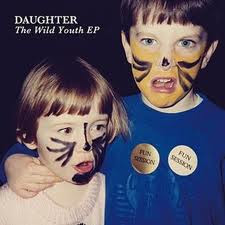
I researched artists who are similar to my artist and I managed to find artists such as Birdy, Daughter, Kate McGill and Lauren Aquilina. All of these artists' genres are slow and acoustic songs including guitars and/or pianos. Two of the front covers below have the artist on, their name and the name of the album. However the last one which is Daughter's album cover has an image of two children that possibly relate to one of her songs or the album itself, followed by the name of the artist and the name of the album. These artists are all very young and around my artist's age. They also have similar dress senses and style as my artist, which is quite vintage and different.

These are some of the album covers of these artists:


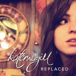
Kate McGill: The artist I decided to focus on mainly though, is Kate McGill. She is a 22 year old Welsh singer and songwriter. She isn't very well-known outside of the UK, however she is originally known for her covers of hit songs by artists such as Adele, Mumford and Sons, Paramore and many others. She only has one album that she released in 2011 called 'Replaced.'

Front Cover: This is the front cover of her album 'Replaced,' and I thought it was very simple. It includes the name of the artist, the name of the album and an image of the artist in a location which may relate to one of the music videos on the album or one of the songs. This album front cover inspired me as it is something similar to what I would like on my digipak as it includes a distinct image of my artist on the front.


Birdy: Another artist I decided to focus on as well as Kate McGill, is Birdy. Birdy is a 16 year old English musician who is well known for her covers of different artist's songs such as Skinny Love by Bon Iver and The A Team by Ed Sheeran. She is similar to my artist as she does acoustic, soft covers which are also quite slow like Kate McGill's music and she has a similar target audience to my artist.

Front Cover: This front cover similarly to Kate McGill's is very clear and simple. It includes an image of the artist and the name of the artist. It is quite inspiring because it is an effortless album cover and reflects the genre of music she sings. I like the font of the artist's name as it stands out easily and even though it is faint it clear to see.


Back Cover: The back cover of this album looks very mellow and pleasant. It inspires me because again I like the font as it is gentle and a nice colour to go with the other colours on the album. The colours are a weird and bizarre but unique mix of blue, green and white colours, which I find interesting. The back cover of this album includes the names of every song on the album, otherwise known as the tracklist and the barcode.


The CD: I could not find an image of the inside cover of this album, however I did find an image of the CD itself. It is similar to the back cover of the album, as it includes the different and kooky colours. It also has the name of the artist on it and information about the Record Label in small font at the bottom of the disk. I discovered that on the front and back covers of the album and on the CD, the same font is used. This is important so that all of the sides and faces of the album/digipak show a connection and associate together.