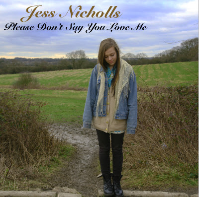
I have now completed my front cover of my digipak, this is what it looks like:
I feel that it expresses the exact type of music that my artist sings and reflects from it really well. This is because it is very simple and represents nature in an optimistic way. The gold and black colours for the font displays my artist's identity and brand image. I edited this picture, by adjusting the levels of Saturation & Hue and Brightness & Contrast, to make the image look better and stand out more. When I used the Saturation levels and adjusted them, it made the sky have a violet sort of colour, and I really liked this as it presents nature in a beautiful way.
Furthermore I have now begun starting my back cover of the digipak. So far I have only placed the image on there and edited it using the Exposure and Sharpness levels, and it stands out very clearly but at the same time looks a lot darker than my front cover. I have the tracklist, the record label and the barcode left to put on there but I will hopefully have finished all of this by the end of next lesson.

No comments:
Post a Comment