Wednesday 30 January 2013
Learning To Use Photoshop
In today's lesson, we have started learning how to use Photoshop, so that when we create our Digipaks and magazine adverts, we know how to use this program to edit them. I have found it very difficult as I haven't quite got the hang of it yet, however I am improving on learning how to use it.
Thursday 17 January 2013
Spider Diagram of Artist
As a class, we watched every group's music video and gave feedback about what we thought the brand image/ artist's identity was. This is an image of a spider diagram of our artist's identity and brand image. It includes colours that associate with our artist, different textures, moods of the video, and the style of our artist.
Sunday 13 January 2013
Digipak Research: Similar Artists
Research the album/single covers of an artist who fall into a similar genre of music and/or have similar brand identity.
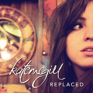
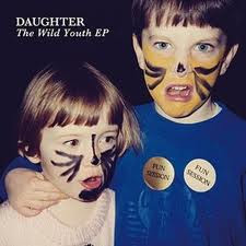
I researched artists who are similar to my artist and I managed to find artists such as Birdy, Daughter, Kate McGill and Lauren Aquilina. All of these artists' genres are slow and acoustic songs including guitars and/or pianos. Two of the front covers below have the artist on, their name and the name of the album. However the last one which is Daughter's album cover has an image of two children that possibly relate to one of her songs or the album itself, followed by the name of the artist and the name of the album. These artists are all very young and around my artist's age. They also have similar dress senses and style as my artist, which is quite vintage and different.
These are some of the album covers of these artists:
Kate McGill: The artist I decided to focus on mainly though, is Kate McGill. She is a 22 year old Welsh singer and songwriter. She isn't very well-known outside of the UK, however she is originally known for her covers of hit songs by artists such as Adele, Mumford and Sons, Paramore and many others. She only has one album that she released in 2011 called 'Replaced.'
Front Cover: This is the front cover of her album 'Replaced,' and I thought it was very simple. It includes the name of the artist, the name of the album and an image of the artist in a location which may relate to one of the music videos on the album or one of the songs. This album front cover inspired me as it is something similar to what I would like on my digipak as it includes a distinct image of my artist on the front.
Birdy: Another artist I decided to focus on as well as Kate McGill, is Birdy. Birdy is a 16 year old English musician who is well known for her covers of different artist's songs such as Skinny Love by Bon Iver and The A Team by Ed Sheeran. She is similar to my artist as she does acoustic, soft covers which are also quite slow like Kate McGill's music and she has a similar target audience to my artist.
Front Cover: This front cover similarly to Kate McGill's is very clear and simple. It includes an image of the artist and the name of the artist. It is quite inspiring because it is an effortless album cover and reflects the genre of music she sings. I like the font of the artist's name as it stands out easily and even though it is faint it clear to see.
Back Cover: The back cover of this album looks very mellow and pleasant. It inspires me because again I like the font as it is gentle and a nice colour to go with the other colours on the album. The colours are a weird and bizarre but unique mix of blue, green and white colours, which I find interesting. The back cover of this album includes the names of every song on the album, otherwise known as the tracklist and the barcode.
The CD: I could not find an image of the inside cover of this album, however I did find an image of the CD itself. It is similar to the back cover of the album, as it includes the different and kooky colours. It also has the name of the artist on it and information about the Record Label in small font at the bottom of the disk. I discovered that on the front and back covers of the album and on the CD, the same font is used. This is important so that all of the sides and faces of the album/digipak show a connection and associate together.
Friday 11 January 2013
Digipak Research: Form & Conventions
1) What is a digipak and how is it similar/different to an album cover?
- A digipak is a patented style of CD or DVD packaging. Digipak-style packaging is often used for CD singles or special editions of CD albums. They typically consist of a gatefold (book style) paperboard or cardboard outer binding, with one or more plastic trays holding a CD or DVD connected to the inside.
- The differences between a digipak and an album cover are:

- Digipaks give a product an expensive and professional look and feel about it, especially when they are well designed.
- Digipaks are made out of cardboard whereas normal CD cases are made out of plastic.
- Digipaks can usually fit more than one CD inside. For example there are digipaks that can include up to four CDs.
2) What does a digipak net look like and how many faces are usual?
- A digipak usually has four faces, however they can have up to six or even eight faces.
Four faced net:
Four faced net:
Six faced net:
3) What do we usually find on the various faces of a digipak?
-Front cover- on the front cover you usually find an image of the artist to ensure they are memorable and the name of the album.
-Back cover- on the back cover you usually find the track list and digital extras. Also the barcode or possibly another image of the artist or the record label logo.
-Inside cover- on the inside cover you could find a lyric book.
-CD tray- is often not a particularly detailed image, but an image that compliments the brand.
4) Does there need to be a connection between the faces on the digipak?
Yes, there does need to be a clear connection between all of the faces on the digipak in order to create a very coherent image of the artist for the audience to understand.
Monday 7 January 2013
Subscribe to:
Posts (Atom)


